Music Dustin O’Halloran interview (A Winged Victory for the Sullen)
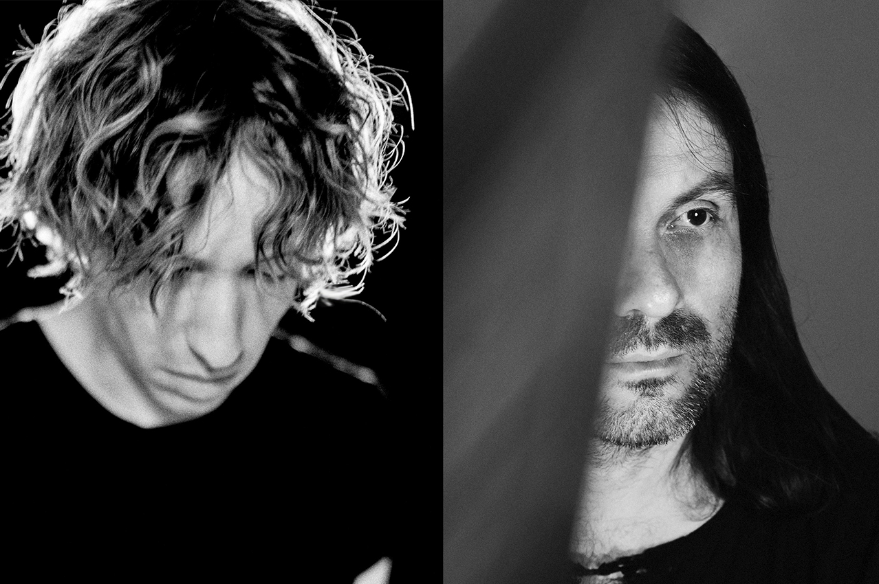
In our on-going series of interviews with front runners who are redefining music we present an interview with the American composer and pianist Dustin O’Halloran. Together with Adam Wiltzie he is the brainchild of A Winged Victory for the Sullen (AWVFTS). With their instrumental music they seek to express feelings that can't be expressed in words.
“We almost didn’t make that show,” O’Halloran reveals to me when I speak with him on the AWVFTS concert at the St George’s church in Brighton. The night before the band performed in Belfast and had to drive 700 miles in a day to get to Brighton and barely made it. “There were many other problems like some electricity issues at the venue but it ended up my favourite show of the tour”, O’Halloran enthuses. “The energy of the crowd, the church venue and the light show that was created for us. We were so happy that the concert was actually happening.”
For one and half hour the audience was captivated by the dreamy, enchanting and mysterious atmosphere created by the musicians. O’Halloran’s sparse and reflective piano chords, the tender strings that slowly ebb and flow and Wiltzie’s guitar manipulations sounded almost celestial but very fitting for the church venue.
In a clip on ‘Breakdown Sessions’, O’Halloran explains why he and Wiltzie, prefer to take themselves out of the music and gravitate towards instrumental music. “We want the music to be in the forefront to express feelings that can’t be expressed into words. The magical ability of music is that you can translate universal feelings that breaks barriers of all languages”.
It echoes an idea first introduced by a group of eighteenth century German Romantics (including Johann Wolfgang Goethe and E.T.A. Hoffmann) who introduced the idea of absolute music, i.e. non-representational music. This form of music focuses on structure, melody, harmony and rhythm. Goethe and co believed that music could be more emotionally powerful and stimulating without words.
The central intention in abstract art is clearly explained in the excellent book ‘Great Thinkers’ published by The School of Life. “Abstract art is to get directly to emotion and to bypass representation. Like music, abstract art… is giving a form to certain of our inner states or moods”.
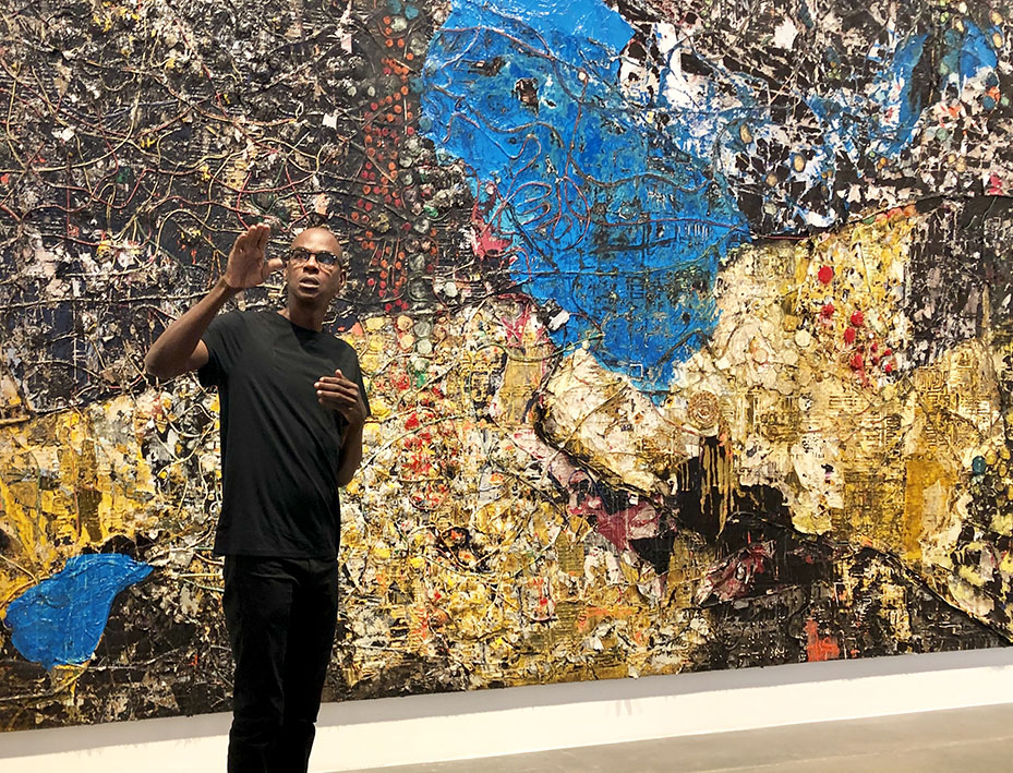
 The music of AWVFTS goes directly to the emotion of the listener. The effect is similar to what great abstract art does. O’Halloran tells me he loves abstract art and minimalism like Mark Rothko’s large scale paintings with rectangular fields of colour that bring the viewer in a state of being enveloped.
You can hear his love for minimalism in his solo piano music. His composition Opus 23 for the soundtrack of ‘Marie Antoinette’ and the melancholic main theme for the TV series ‘Transparent’ share a baffling simplicity with Josef Albers series ‘Homage to the Square’ or works by Donald Judd. The meditative mood of these piano works evoke Hiroshi Sugimoto’s photographs of seascapes or transport the listener to the Ryoan-ji Zen garden in Kyoto or the main chapel of the Ibaraki Kasugaoka Church designed by the architect Tadao Ando.
There are more parallels with his music and abstract art such as the titling of the AWVFTS songs. Rothko and Judd numbered or left their work ‘untitled’ as they prefer the work to speak for itself and want the viewer to come up with their own interpretation of their work. O’Halloran and Wiltzie didn’t title the songs on their album ‘Atomos’ but gave them Roman numerals.
Other artists working in abstract art gave their work odd but intriguing titles, such as ‘Who’s Afraid of Red, Yellow and Blue’ by Barnett Newman’s or ‘Rosy-Fingered Dawn at Louse Point’ by Willem de Kooning. Remarkable AWVFTS song titles are ‘Steep Hills of Vicodin Tears’, ‘Aqualung, Motherfucker’, or ‘Keep it Dark, Deutschland’.
 The artwork of their latest album ‘The Undivided Five’ is abstract as well. The designer of the album, Davy Evans, commented on the artwork: “The overall visual concept was to build an unfamiliar world based solely on light, showing the descent into darkness with various photographic techniques.” This compelling cover could adorn your house when you put it in a frame and hang it on your wall.
Within the many forms of ambient music, ranging from electronic to space to neo-classical, AWVFTS is an exponent of the latter form together with Ryuichi Sakamoto, Max Richter, Ólafur Arnalds, Jóhann Jóhannsson and Nils Frahm. Some of these musicians are piano virtuosos and effortlessly fuse modern classical with the ambient genre. Their music does what Brian Eno considered to be the intention of ambient music; “to induce calm and a space to think”.
The current pandemic offers the world an opportunity for reflection. O’Halloran lives between Reykjavik and Los Angeles and tells me via Skype he decided to stay in the capital of Iceland as he found the situation in the US too unsettled. In Part I of this interview O’Halloran discusses his penchant for playing the lower register of the piano and the emergence of neo-classical ambient music. In the second part we discuss his soundtrack compositions including his latest work ‘Ammonite’ and what music people are listening to in this lockdown period.
200%: You differ from other piano players that you are not working in the big dynamics of the piano but the lower dynamics. A great example is ‘Our Lord Debussy’ from the latest AWVFTS album. What makes you interested to work in the lower dynamics?
Dustin O’Halloran: I find it more intimate. Also, I didn’t do conservatory or have any formal training so the idea of playing the piano in a virtuostic way wasn’t what I was using the instrument for. The emotions that are more interesting to me are these more subtle, detailed emotions rather than the big dynamic. I just really love how the piano resonates when the hammers hit the strings really softly which brings a certain warmth and intimacy.
200%: Could this style of playing also be a reflection of your character?
DOH: In music and art I’m interested in minimalism, space and subtlety – creating a lot with a little. I’m interested to find big emotions by using minimal techniques which is maybe more direct. Like the paintings by Mark Rothko. I think they are so beautiful, minimal and powerful. When you look at them closely there is so much happening with the colours. I’m attracted to things that makes you want to be drawn in, pull you in slowly, rather than being bombarded with something.
200%: Claude Debussy is one of your favourite composers. What draws you to his music?
DOH: I love his chord progressions and his whole tone scales. There’s a lot of openness, emotional space in his music and it’s incredibly beautiful. I love the silences between the notes and in the way that it moves, it’s like water. It is the most ‘watery’ formation of music in terms of fluidity. There’s nobody like Debussy.
200%: Is ‘Our Lord Debussy’ a homage to Debussy?
DOH: Yes, with that track we wear our heart on our sleeves. It was born out of process when Adam and I were doing a remix of ‘Ég Heyrði Allt Án Þess Að Hlusta’, a quartet piece from Jóhann Jóhannsson’s album ‘Englabörn’. We had a stereo recording of this quartet and we were figuring out how to do a remix of a stereo recording. So we started to deconstruct the actual notes of the track and started to pull out the cello part, the viola part etc. We basically recomposed the DNA of this piece and became very inspired by this process. There is a Debussy Prelude No. 1 with just one single bar of music in 4/4. It’s about six chords. It is a passing bar of music that continues throughout the whole prelude. I thought it was fascinating to make an entire piece of music based on just the DNA of the single bar of music. It’s a macro approach and Adam and I took these six cords and pulled them apart. We did all these variations on them and pulled it in all these different directions and created something new out of it.
200%: Do you prefer to play on the grand piano or upright piano?
DOH: I like them both. A really nice grand piano can be a great instrument. There is a lot of control and dynamics and you have this beautiful bass. A grand piano can sound really crystal and very sharp. I love the upright because there is something really direct and humble about it. The same song played on an upright and a grand piano creates a different feel and emotion.
200%: The piano you played on the last tour was that piano travelling with you?
DOH: No. We had to hire a piano for each concert.
200%: Is it difficult for you to adapt to another piano each evening?
DOH: Winged Victory is more about the bass section of the piano as I’m playing mostly in the lower than the higher registers. We always trying to have some kind of standard piano quality that we want. We’re using microphones and pickups inside the piano so we are able to control the sound a little bit better even if it’s not always the right piano.
200%: Over the 15 years there has been a wave of musicians who share an interest to combine neo-classical elements with electronics music. To name a few Olafur Arnalds, Max Richter, Bryce Dessner, Nils Frahm and yourself included. Do you have an explanation where this interest comes from?
DOH: I don’t know how we all ended up working in this realm, I can only speak for myself. I grew up playing in a band and then started to write piano compositions. I was always attracted to instrumental music and I love classical, experimental and electronic music. It was a combination of bringing those together. There was never an intention of trying to make post-classical music. Adam has been making drone music for twenty years and I’ve been playing piano. We just got together and we just made music. I think sometimes there is a hive-mind in the world and similar ideas pop-up at the same time. It’s just a matter of cultural timing and the way of the interests of the people align. When I made my first piano record I was living in Italy in a town of 30,000 people and had very little contact of what was going on [in the world]. The year I released my first solo album, ‘Piano Solos’ in 2004, Chilly Gonzales put out his record ‘Piano Solo’. How do you explain that? Sometimes things are just floating around in the world and people are attracted to the same things in the same moment.
Interview written and conducted by Thierry Somers
Photo Dustin O’Halloran: Jónatan Grétarsson
Mark Rothko, Orange and Yellow, 1956; Study for Homage to the Square: Aurora, 1957 | Image: © 2016 The Josef and Anni Albers Foundation/Artists Rights Society (ARS), New York; installation of 15 large concrete boxes by Donald Judd, Marfa, Texas. When you click on these abstract works you can hear Dustin’s compositions that we think evokes the mood of these artworks.
Dustin O’Halloran Part 2:
In the second part of our interview with Dustin O’Halloran we discuss his soundtrack compositions including his latest work ‘Ammonite’ and what music people are listening to in this lockdown period. Subscribe here to the 200% website and you won’t miss this interview.
Interested in more interviews with neo-classical / ambient musicians? Read our interviews with Max Richter, Murcof and Bryce Dessner

