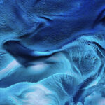
 For his project ‘Fig. 1-99’, the photographer and graphic designer, Anthony Gerace, created 100 colour studies on vintage paper sourced from magazines including ‘Life’, ‘Time’, ‘Playboy’ and others. Out of these source materials, Gerace created some fascinating chromatic collages with subtle colour gradients. The balance between figuration and abstraction in Gerace’s work is intriguing, for example in ‘Only One’, a raspberry coloured image where one can recognise the silhouette of the helmet of darth vader.
Subsequent to discussions with Gerace regarding his work, we asked whether he would be interested to create some collages based on the four printed editions of 200%, and to discuss his creative process in doing so.
The Canadian born artist, currrently residing in London, quickly responded and told us he was excited by the idea to make a collage based on contemporary sources – something he had never undertaken before.
200%: Can you explain your train of thought as to how you came to create these images out of the visual material of 200%?
Anthony Gerace: The train of thought is pretty simple – look for areas of tone with minor variation or interesting typography, isolate them, and then destroy and rebuild them. It was weird working with contemporary sources as I’m so used to looking for muted, soft-palette colours, and of course that becomes much harder when the magazine is printed on glossy paper. It was, though, a really interesting challenge: I ended up taking as my source imagery from pretty different pages per issue.
It’s weird as the headspace I’m in when I’m making collages – especially more abstract ones – is one of desperately trying to make it fit together in the ‘right’ way, even if I don’t know what that way is. Thus, a lot of the time I’m unaware of my thinking process outside of knowing it needs to be perfect, even if I don’t know what that actually means.
 200%: Are you in your collages looking for a balance between abstraction and figuration?
AG: Yes and no. I think that in my most recent body of work, ‘People Living’, I’m trying really overtly to find that balance, and to find the place where the abstraction of the colour studies can exist within more traditional and clichéd collage forms. I really like the pureness of tone and line that the colour studies let me explore, and how to find humanity in the subtleties. I think figuration in my abstract work is both the most subtle and the least important element: it’s there, and it’s encoded in the source material, and it’s responsible for a lot of the conceptual elements of the work, but it’s not necessary for the pieces to be engaged with – so I’d say that whatever balance I find is an added bonus: for me, it’s as much about the exploration as it is about the end result.
 200%: The idea of a collage is where the artwork is made from an assemblage of different forms, thus creating a new whole. Is that also your idea about collage? If yes, for what kind of new whole are you looking with the new images based on the artwork of 200%?
AG: For me it’s less about an objective and more about seeing how the work changes along the way, at least with the abstract pieces I do. I’m not looking for anything particularly but, instead, looking to the mechanics of the source images themselves (colour, tone, form, and counter form) as a way of defining the new image. In that respect, what I’m looking for is defined entirely by its source. Thus, you can’t really define collage as anything but “an assemblage of different forms […] creating a new whole”. The language just isn’t there yet. It doesn’t follow that to assemble something new means that you’re necessarily looking for something – that becomes the definition of objective, figurative collage, and that isn’t what I do. It’s not simply a “yes” or a “no” (or in this case an enforced “yes” as there definitively can’t be a “no” to the first question whilst still describing it as collage… yet, at least). The result I’m looking for is one that’s emotive and readable without being direct or objective, that isn’t reliant on a cultural trope of any kind to make it work. I don’t know if I’m quite there, but it’s always the goal.
200%: Are the images that you created related to the theme of 200%: a magazine that features passionate creative people who live life to the full for their art?
AG: If they are, they are in the broadest sense: I think any image made that defines itself as art and is created as an end unto itself (as these were) is related to the idea of living life to the fullest. As I’m not really sure what that means – living life to the fullest is such an objective thing – although I know that I try and live to my ideals in everything I do. Thus, in that respect, they are related to the theme.
 200%: Whom do your consider to be great collage artists and why?
Contemporary: Jacob Whibley, as he uses the absolute least amount to the greatest outcome, without resorting to figurative imagery. His work is that to which I aspire: completely abstract, apropos of nothing, yet totally true to the qualities of its sources and aware of the disconnect between the forms he creates and the ones that he’s using.
Matthew Partridge, for incorporating typography so eloquently into his work and with such a sense of humour, without sacrificing the strange otherworldliness that his collages have.
JP King, for his work ethic and his ability to make incredibly technical and well thought out pieces look effortless and naive. His work looks like it just fell on the page, and stuck. It’s that good.
Historically: Kurt Schwitters, because of course Kurt Schwitters: he managed to turn the crassest advertisements of his era into timeless and resonant pieces of art that were also politically conscious acts of protest. The kind of collage he made has never been made successfully in my lifetime, and always dates itself immediately. It might just be the language barrier, but to me it’s incredible (and incredibly inspiring) that his work remains as relevant today as it was when it was made.
Interview conducted by Thierry Somers; All images by Anthony Gerace. From top to below, image based on issue 2; image based on issue 1, and ‘Fig. 20’.

