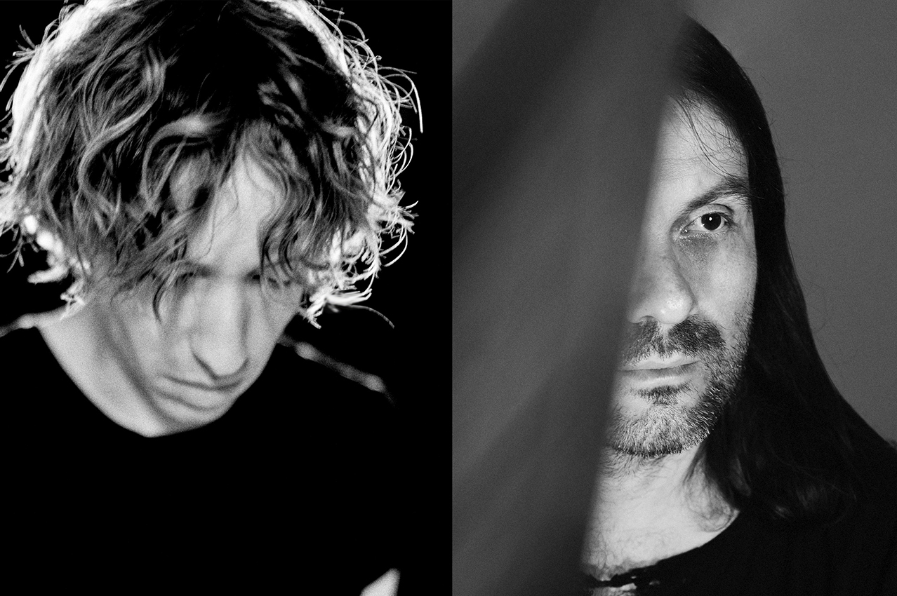
Autechre’s album cover “Oversteps” is one of the 50 nominees of Best Vinyl Art 2010. 200% asked the designer of “Oversteps”, Ian Anderson of The Designers Republic, to share some insight into the creative process as to how the artwork originated.
200%: Did you hear the tracks of “Oversteps” that Sean Booth and Rob Brown of Autechre created before you started to work on the artwork of the album?
Ian Anderson: No. I chose not to listen to it all until I wanted to populate the basic idea. I usually don’t listen to the music first. I’m interested in the motivations and inspirations of the artist and I’d rather refer to their source material than their output. I’m more interested in what they want to communicate to which audience, and why. I want to create something that exists in parallel to their response to their input, rather than reflecting, or attempting to, represent their output.
200%: Were Sean and Rob involved in the creative process of the album’s artwork?
Ian Anderson: Yes, they had to understand what I was doing, and be ok with it. Over the years we have developed an understanding, and they know that I’ll probably get closer to that which they aspire if they don’t tell me what they want. Of course we discuss their work, and where their heads are at before starting the project.
200%: From where did the idea of the black circle come? Was is inspired by Kazemir Malevich’s painting “Black Circle” from 1913?
Ian Anderson: No, the similarities are not intentional. The “Oversteps” artwork relates to Autechre’s work.
200%: Malevich was also the founder of “Suprematism” – the “grammar” of this art movement was based on fundamental geometric forms; the square and the circle. On a forum discussion on the artwork of “Oversteps” someone wrote: “Have any of you armchair conspiracy theorists noticed that Quaristice’s [Autechre’s album before “Oversteps”] artwork involved a series of squares whereas this album [“Oversteps”] is all circles?” Is that a correct observation and was it done deliberately?
Ian Anderson: In both cases there was a sense of reducing the essence of the visual communication to the raw data of simple geometry but there was no plan. “Oversteps” was a reaction to “Quaristice” only by the same degree as the music, and Sean and Rob’s intention.
200%: Was the black circle painted by hand or created with Corel Painter on a computer? How many circles did you create before you said: “this is the one” for the cover of the album?
In fact, did you create not one but 14 slightly different black circles corresponding with the amount of tracks on the album – just like the artwork of “Yes, Pet Shop Boys.” where the 11 squares on the cover stand for the 11 tracks on the album?
Ian Anderson: The number of circles relates to the number of iterations for various mediums in which we needed to use the cover image, or a version of it.
Across the limited edition vinyl packaging and vinyl labels, and over the CD packaging and to digital only releases, ads, posters, merchandise, point of sale, etc, the same circle never appears twice. We painted around 72 circles on various media with various brushes.
With “Quaristice” the combinations of squares and colours and relative size did not relate specifically to the number of tracks.
We didn’t aim for any revelation in finding the “one” [circle] image for the front of any of the formats. We painted some bigger circles for bigger reproduction and some smaller ones for labels and digital.
200%: What is it that you want to communicate with the “Oversteps” artwork?
Ian Anderson: Human imperfection in the quest for technical (or technological – in Autechre’s case digital) perfection.
For me, Rob and Sean are two very human characters, full of the contradictions that define us all, and yet for two people, vivid in their own ways, they seem, to me, to strive to become subordinate to science and technology, reveling in finding ways to create templates that will, by mathematical equation, extract or divorce them from the creative process; by building theoretical machines (software) that they can operate to build sound.
And yet, for all this, they have crafted an album that, for me, has an ambience of something human-made and organic sounding, a sound that can be felt and experienced three-dimensionally. For me, there is a spirit of the improvised meandering of a pre-service church organist accompanied by the barely inaudible murmur of the congregation – this is a creative response not a review.
So… that two, naturally, perfectly “imperfect” people, in awe of, and adept at, harnessing the potential that science has to inform new sounds, new approaches and possibilities, making and using those sounds, coupled with constantly evolving technology should, inadvertently, make an album so full-circle, rich in the soul of real life, inspiring an human attempt at digital perfection in the design and the artwork.
200%: What is your definition of a good record cover? Does the album artwork (for you) have to express the mood of the music?
Ian Anderson: It has to both compliment the product and expand the consumer experience. The artwork should engage, on whatever level, from the listener’s experience throughout duration of the album, or by repeated exposure. It should be something equally cherished to the music, and intrigue to the viewer all the way from purchase to first play, and beyond.
200%: What was the idea behind the raw typeface and its positioning on the album, sometimes, being overlapped by the circle?
Ian Anderson: The font is Norm’s Replica font – the hyper grid-ism of Replica with its cut corners conveys the dry modernism of the future emphasizing the man-machine perspective, that is, the fascination with being the machines we create from the Futurists to science fiction to Gary Numan, early John Foxx etc.
200%: Are you happy that “Oversteps” is nominated as one of the Best Vinyl Art 2010?
Ian Anderson: I’m not sure how I should answer this question. Yes, I’m pleased people see value in what I do, and I’m sure I’d be even more pleased if it won, but honestly, I don’t give a fuck about prizes – I don’t design to enter, or win, awards, and how good what I’ve done isn’t dependent on the say so of a jury. I’m more excited that it has provoked dialogue in the press and on blogs, and I’m stoked that Sean and Rob like it. It does its job.
Interview conducted by Thierry Somers (12/2010)
Pictures: Artwork for Autechre “Oversteps”, The Designers Republic