Music 10 Must See Record Sleeves
The current vinyl boom triggers an exciting resurgence of large format music packaging. A selection of 10 exciting sleeves that embody the renaissance in cover design.
1
Album: Age Of
Artist: Oneohtrix Point Never
Designers: David Rudnick and Daniel Lopatin
Putting Jim Shaw’s work ‘The Great Whatsit’ featuring three women looking in awe to the sky lit by an Apple laptop screen in the foreground should already be enough to make an arresting cover. However the designers went a step further. They printed the words ecco, harvest, excess and bondage on the protective outer record sleeve in experimental, abstract geometric type designed by Rudnick. This combination with Shaw’s painting makes it a fascinating Retrofuturism cover.
 2
2
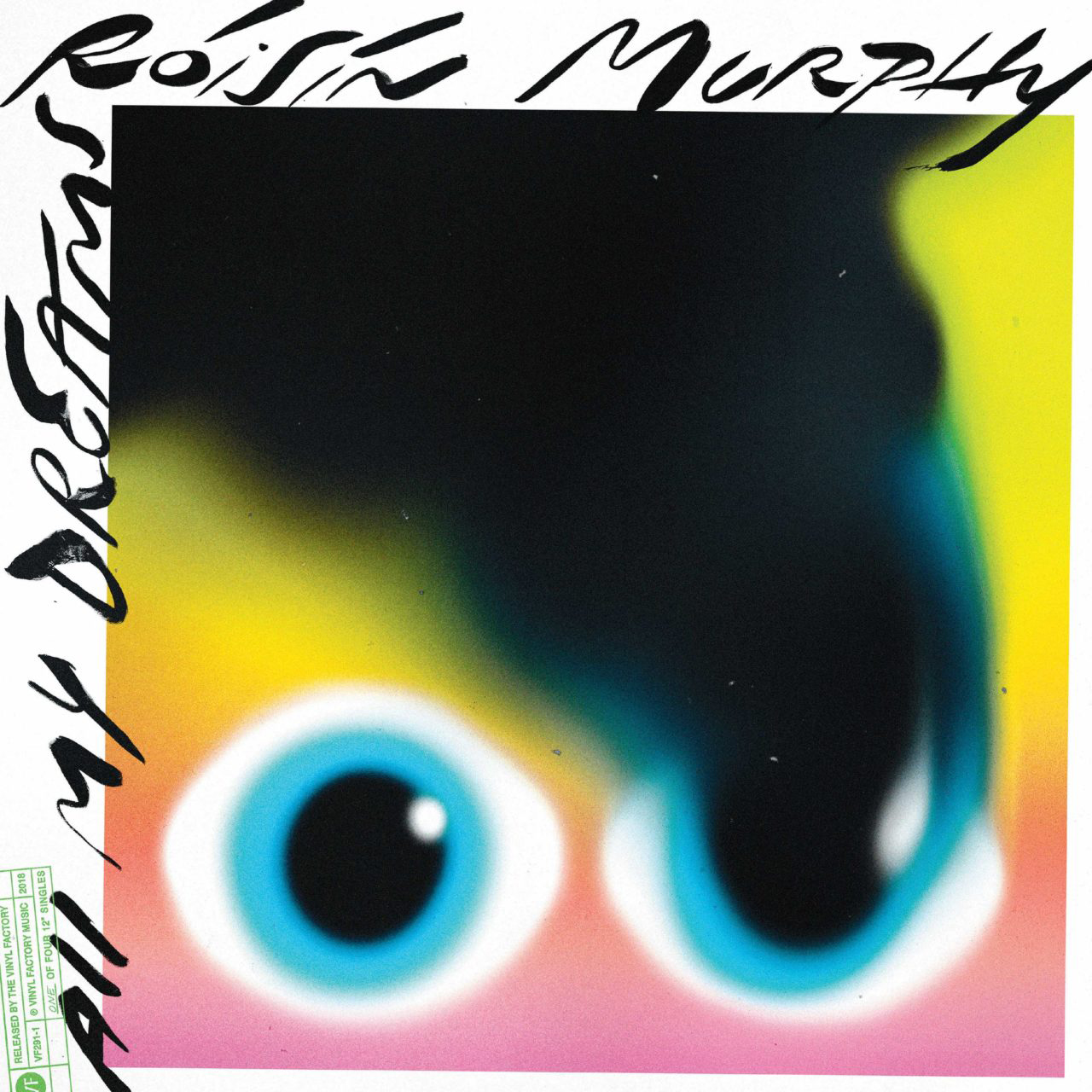
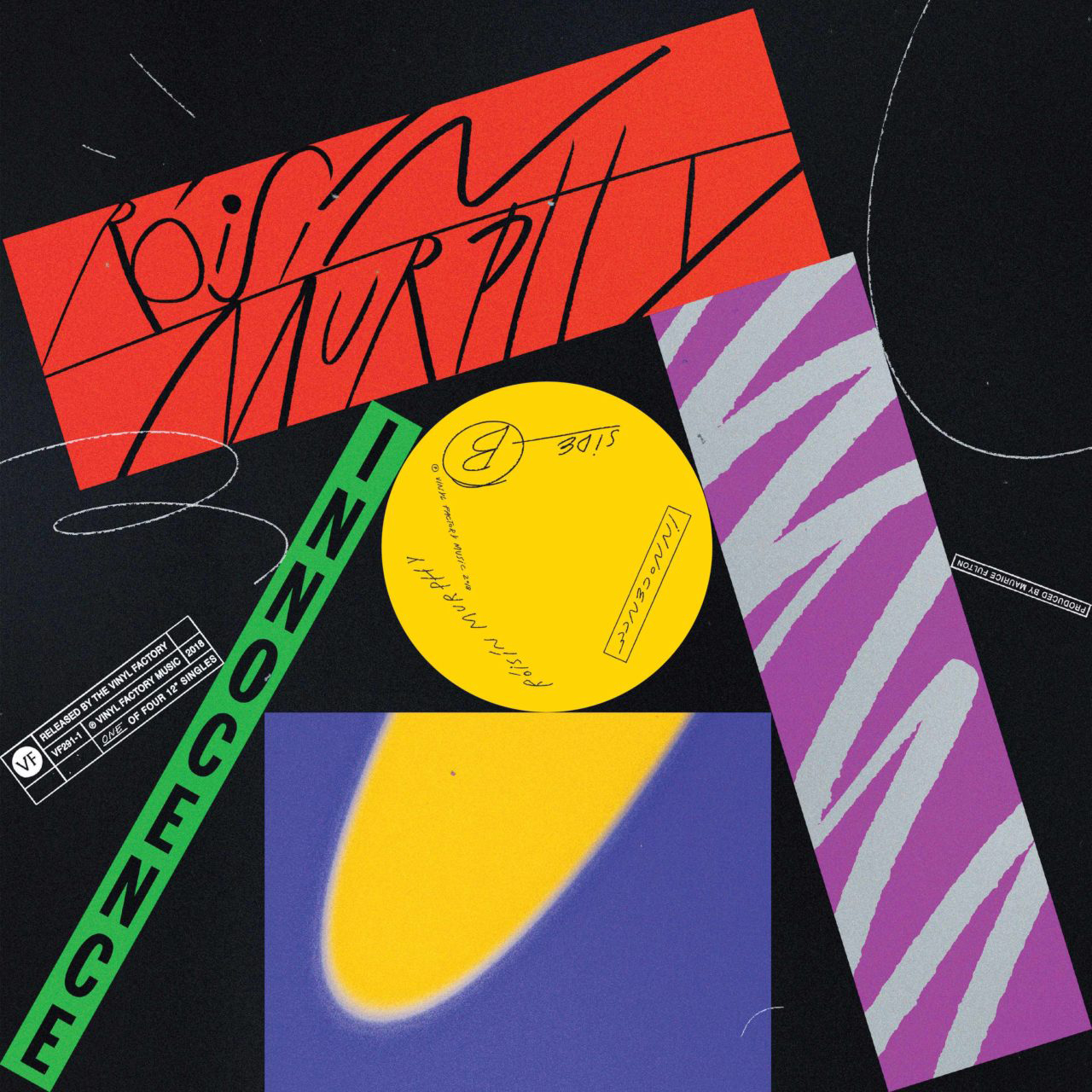
Album: 4×12” Singles
Artist: Roisin Murphy
Designer: Braulio Amado
As each song on this album has a different feel the Portuguese designer make a cover for each song. The covers are bold, experimental and vibrant with airbrush illustrations and hand-drawn type. The typography and graphics are very 1980s like the Duran Duran album ‘Big Thing’ or Janet Jackson’s ‘Control’ album created by the fashion photographer and illustrator Tony Viramontes (who also did the artwork for the Arcadia album ‘So Red the Rose’). There is also a playful comic book and graffiti style type combined with rough, smudged type created by a Xerox machine. It is coherent mishmash.
 3
3
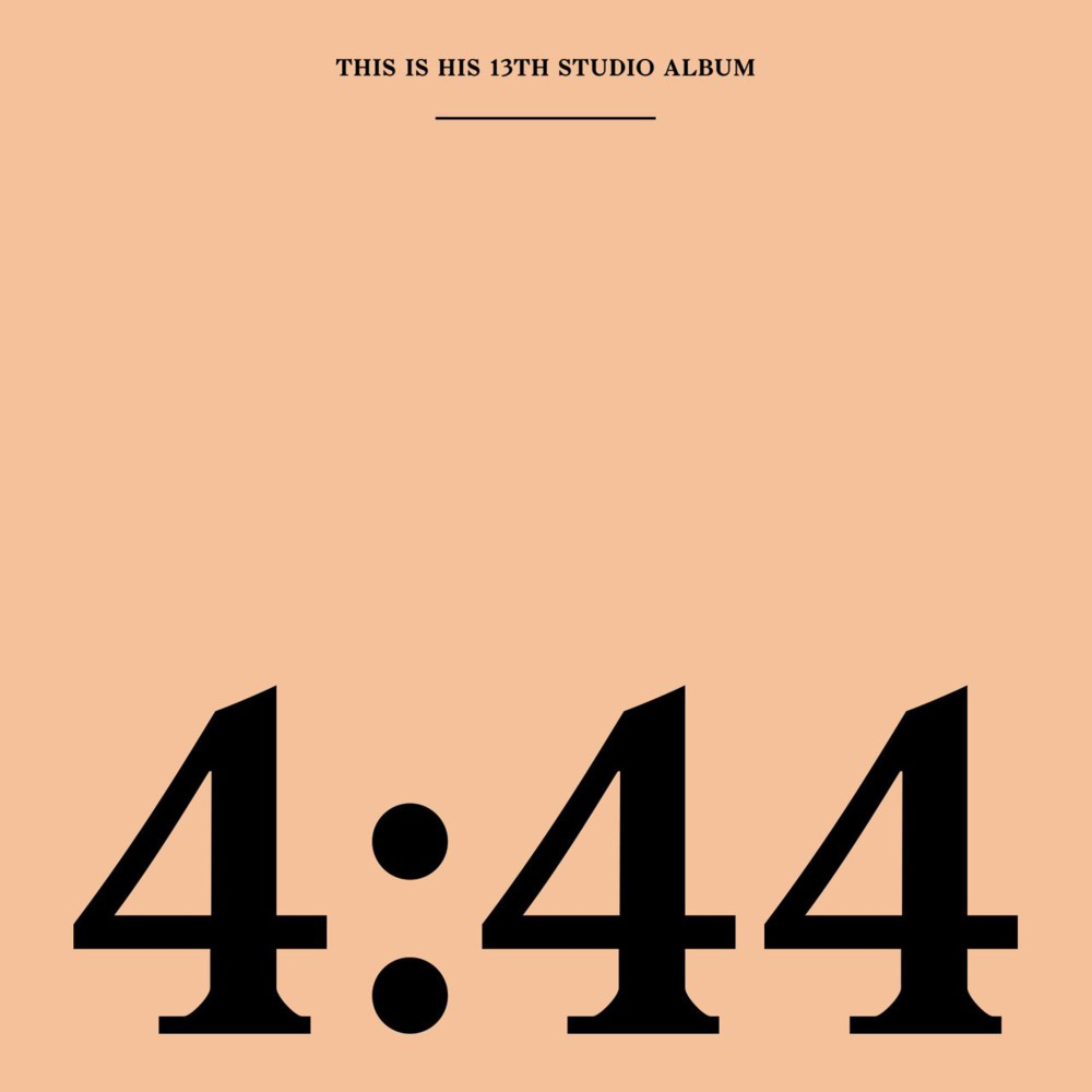
Album: 4:44
Artist: Jay-Z
Designer: Brian Roettinger
Jay-Z explained that the cryptic title of his thirteenth album refers to 4:44 am, the time he woke up to write the song.
For the artwork of this album Roettinger was inspired by corporate branding. The salmon/peach colour played an instrumental role in the promotional campaign of the album. In ‘Album Art’ Roettinger explains that they wanted to own the colour starting with the cover. “Once people are familiar with it – “Oh yeah, that’s the Jay-Z thing” – we can make merchandise that’s just the colour of the shirt and we don’t even have to say the name or title … there were billboards that had no information in the beginning – just the colour.” They hired three billboards in a row and one colour would only mention the title, another just the colour. The campaign works like the trademarked colours of brands like the red and white of Coca Cola, T-Mobile’s magenta or Post-It’s canary yellow.
 4
4
Album: Aleph
Artist: Gesaffelstein
Designers: Fleur et Manu
Not recent (from 2013) but still very beautiful. At first it looks like a Louise Nevelson sculpture, but this foiled outersleeve resembles a circuit board with Aleph the first letter of the Hebrew alphabet in black in the middle of the cover. The CD is a contrast version: an empty CD jewel case with the circuit board printed in white with a gold disc inside.
 5
5
Album: Suspiria
Artist: Thom Yorke
Designer: Dan Perri
The hands and the angular typeface echo the artwork of the famous film poster ‘The Man With The Golden Arm’ designed by Saul Bass. The Suspiria logo was designed by Dan Perri who also designed the title sequences of ‘Star Wars’ and ‘Raging Bull’. The artwork of this soundtrack magnificently captures the essence of this film: the hand gestures of a ballerina are very elegant, but the eyes in the hand palms and the poisonous colour combination of cyan and magenta hint to the horror in the film.
 6
6
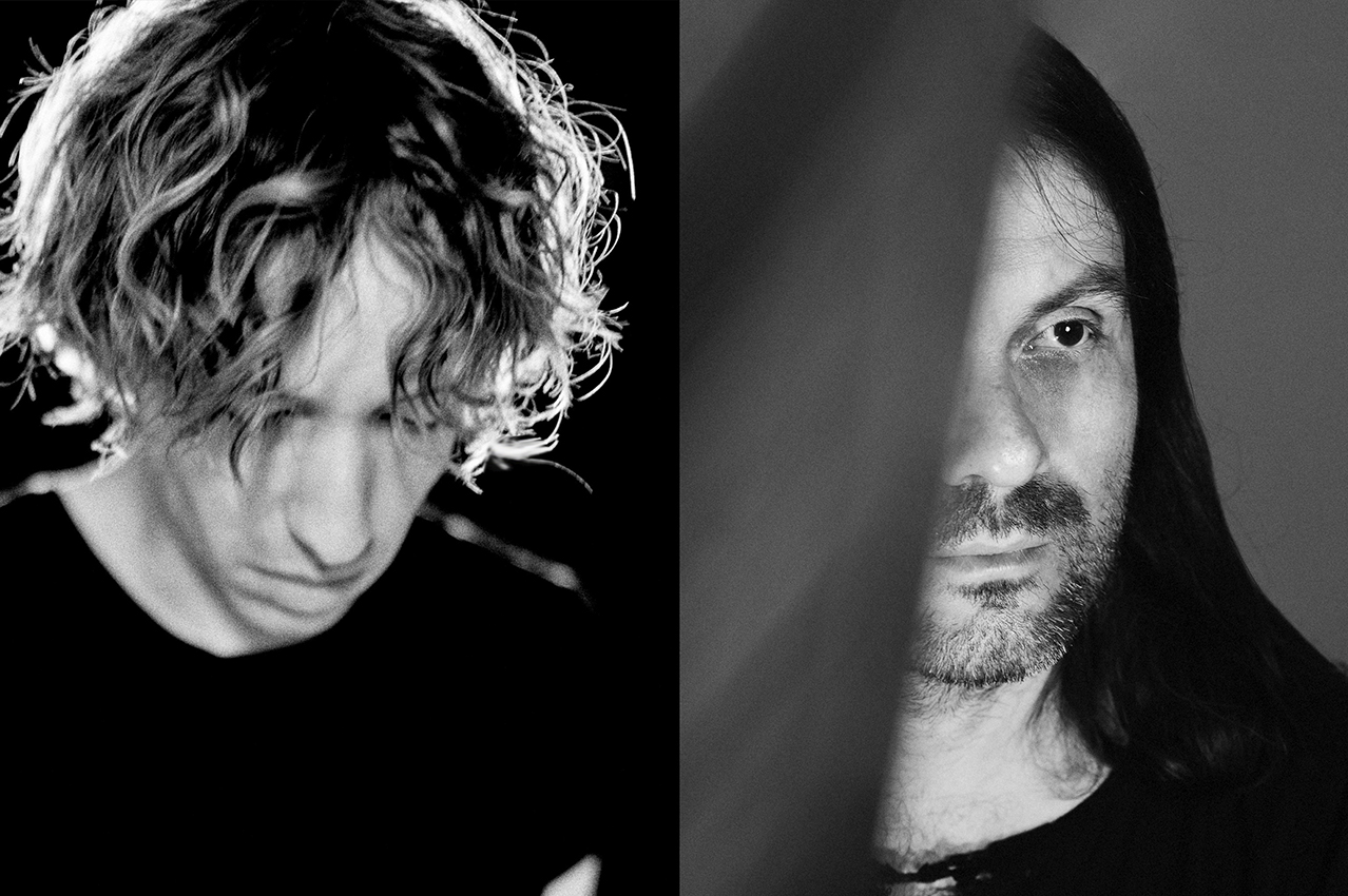
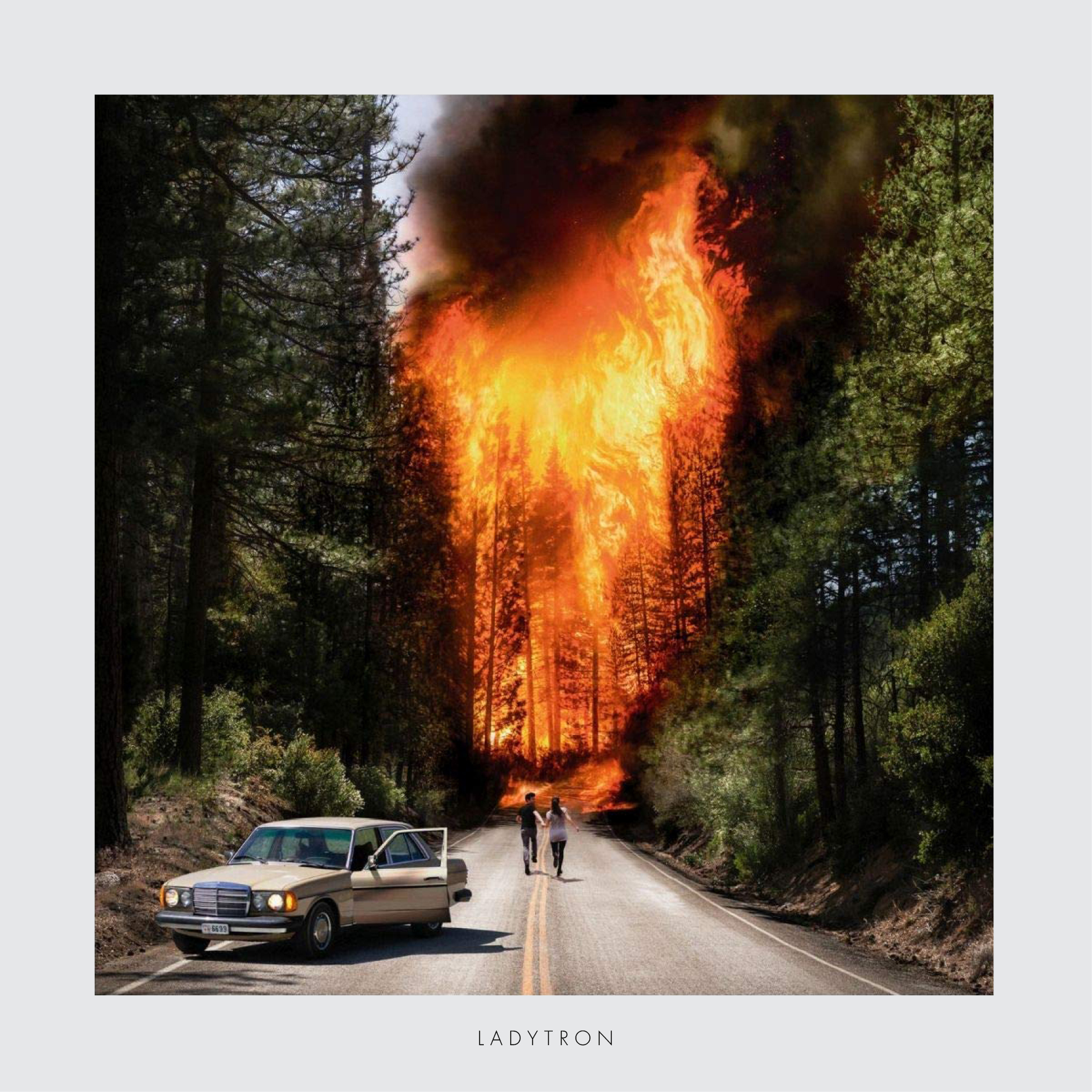
Artist: Ladytron
Designers: Reuben Wu, Jeff Frost, Neil Krug
Reuben Wu is not only a member of the band but also a visual artist and music producer. We spoke with him about this visually arresting record sleeve.
200%: How you came up with the idea for the artwork of the album?
Reuben Wu: The album opener ‘Until the Fire’ and a few other songs on the record refer to fire and smoke in the lyrics. It’s a common Ladytron theme, and not just in our music. We’ve played a few concerts where fire alarms have halted the proceedings or where venues and hotels have burnt down right after we were there.
I wanted to recreate some kind of insane and terrifying moment, where things made no sense, yet looked beautiful. My bandmate Daniel [Hunt] aptly describes it as a “reckoning”. I also see it as an alternative version of the “This is fine’ meme.
I knew I wanted to show humanity in the midst of what was happening, and I also had an old pixellated photo of a wildfire which helped inspire the composition of the picture. I also wanted to make a classic-looking album cover, symmetrical with one point perspective, provocative, and with a touch of Storm Thorgerson for good measure. It needed also to reflect a different standpoint for the band and the new album, a record we made after a seven year long hiatus.
200%: With the image do you want to create awareness for the devastating wildfires in California?
Reuben Wu: No, the image was created long before the wildfires happened.
200%: Is there also something romantic about the image of a couple running into a fire. Is it a modern take on Romeo & Juliet or Kit and Holly in the film ‘Badlands’?
Reuben Wu: There are many many layers of meaning to the image (and specifically the people running into the fire) and it’s impossible to parse them all here, but the two people needed to represent an element of insanity, the idea that you can act in a way despite everything in your environment telling you the opposite. It was important to have two people, and not a single person, so maybe there is an element of romance in there.
200%: How was the image photographed?
Reuben Wu: I collaborated with Jeff Frost, a wildfire photographer and filmmaker, who shared his huge archive of forest fires with me, and Neil Krug, who shot the background and foreground elements. It never fully existed in reality, just a piece of imagination which was brought to life with multiple photographic elements and a lot of time crafting those elements into one coherent vision.
Reuben Wu Neil Krug Jeff Frost
 7
7
Album: Blackstar
Artist: David Bowie
Designer: Jonathan Barnbrook
In the book ‘Album Art’ by John Foster, the designer Stefan Sagmeister commented that “contemporary album covers right now are higher in quality (and significantly cheaper) than much exhibited in the galleries of New York”. This a fantastic example that an album can be a desirable, exhilarating, tangible object. Wonderful are the dye-cut star, the black on black printing and the abstract typography of Bowie’s name spelled in stars. As a bonus there is some magic about the vinyl edition of the album. When you remove the record and hold the gatefold sleeve up to the sunlight, the blackstar will be transformed into an entire galaxy. Just like Peter Saville and Brett Wickens’s design for the ‘Blue Monday’ single, I won’t be surprised if this album will be included by a curator in an exhibition in the future.
 8
8
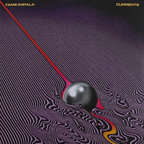
Album: Currents
Artist: Tame Impala
Designer: Robert Beatty
The sleeves of this American designer have a similar absurd, witty and sometimes psychedelic feeling as the ones designed by Hypgnosis. Inspired by the title of the album, Beatty created an intriguing drawing that looks like a pendulum ball of a Newton Cradle rolling in a puddle of oil.
 9
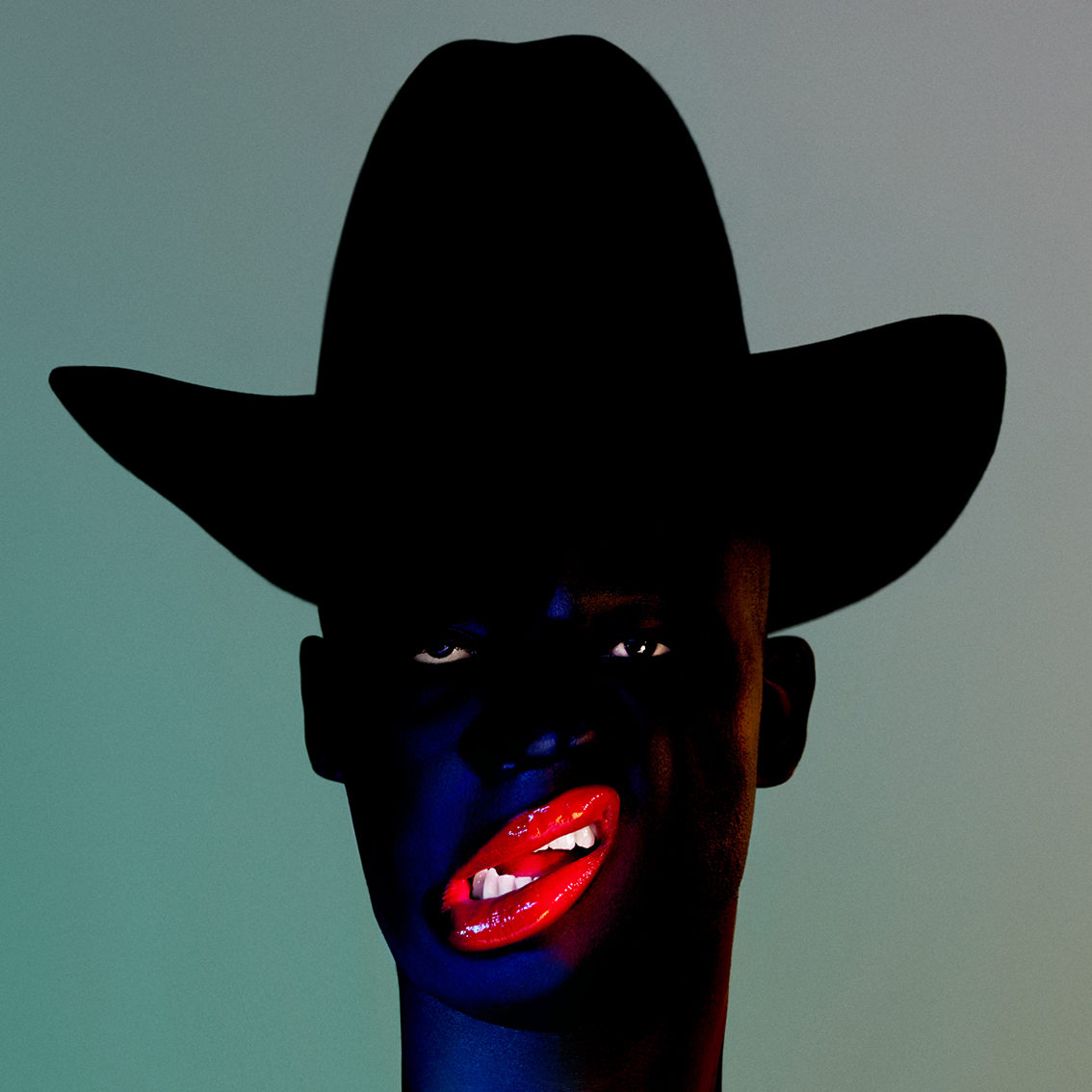
9
Album: Cocoa Sugar
Artist: Young Fathers
Design: Hingston Studio
This arresting image was inspired by Richard Linder’s work. This German born artist moved to New York in the 1940s and twenty years later he started to make hard-edge figurative paintings of gangsters, harlequins, pimps, amazons – some of them erotically charged. The gender fluid people in his paintings is perfectly captured in the album cover photographed by Julia Noni. I love the shape of the lips, the black cowboy hat and there is something unsettling about the bright colours. The image could be contemporary London Soho version of the HBO series ‘The Deuce’ about the advent of the porn industry in New York in the 1970s.
 10
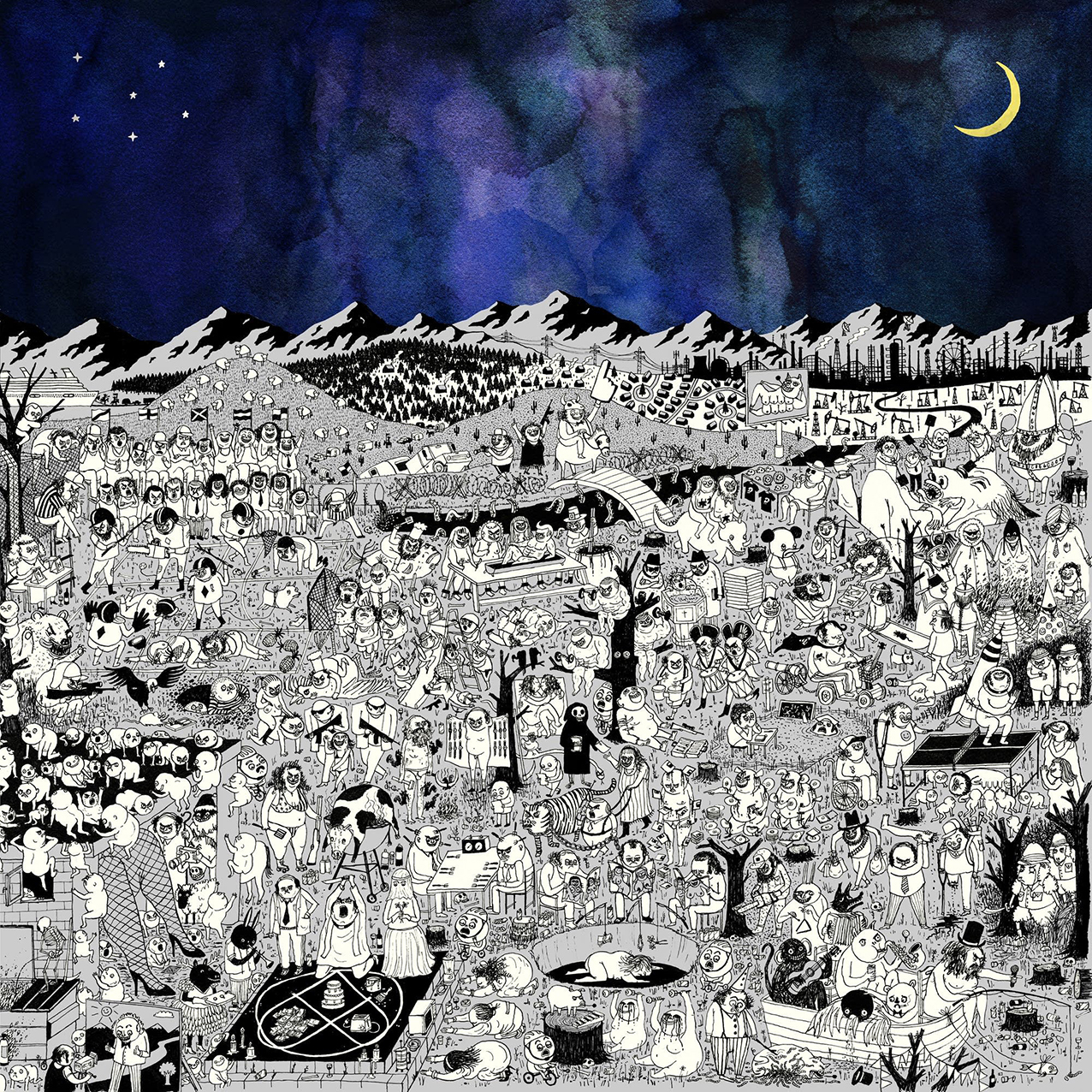
10
Album: Pure Comedy
Artist: Father John Misty
Designers: Edward Steed, Joshua Tillman and Sacha Barr
It’s worthwhile to explore the intricate details of this album while listening to the music. The fascinating, bizarre doodled black and white illustrations are drawn by Edward Steed. Tillman, the former drummer of Fleet Foxes, approached the ‘New Yorker’ cartoonist to draw a medieval nightmare that expresses the theme of his album: the absurdity of human life on earth. The arrangement of the small satirical scenes on a landscape recalls ‘The Garden of Delights’ by Hieronymus Bosch. The drawing is filled with bizarre scenes such as man hitting a golf ball with a severed leg or a flasher showing a collection of watches inside his trench coat. Perhaps not ‘Pure Comedy’ but definitely black comedy.
Missing a recent record sleeve that you think is a Must See as well? Let us know: Mail@200-percent.com
Selected by Thierry Somers
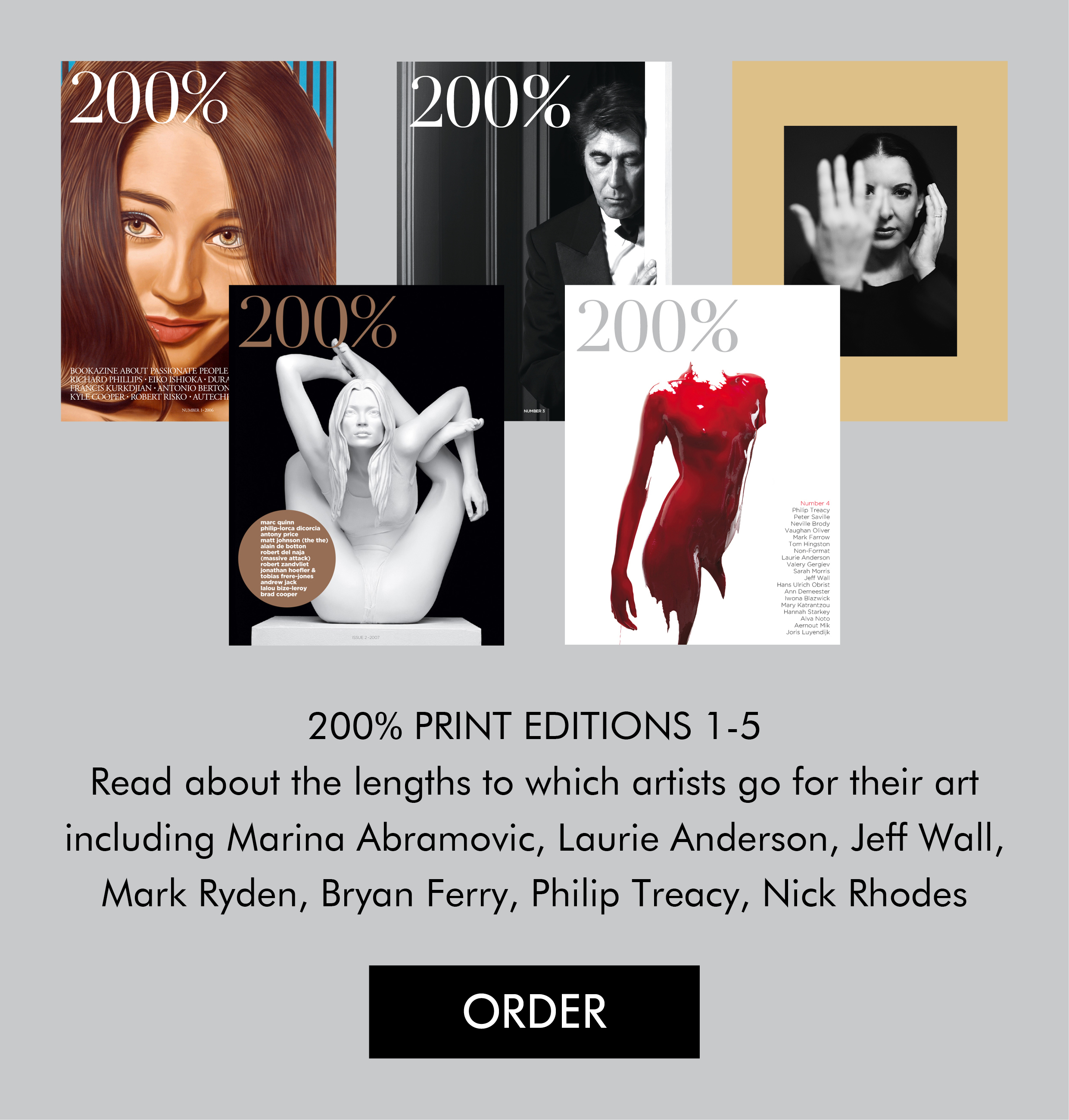
Will you save 20%?
New subscribers can save 20% off the cover price of 200% #4 which features a 28-page story on English sleeve design. The story includes interviews with Peter Saville (New Order, Joy Division), Neville Brody (Cabaret Voltaire), Vaughan Oliver (Cocteau Twins, Pixies), Mark Farrow (Pet Shop Boys), Tom Hingston (Massive Attack). You pay €16 instead of €20. (Free shipping). Type in the code sleeve at the order notes at the Additional Information section and we will send your copy and reimburse you €4 euros. Sign up below and Order 200% #4