Fashion Vogue 100 / Robin Muir Interview
"What unifies the Vogue photographers together is this relentless pursuit of perfection". An interview with Robin Muir, curator of ‘Vogue 100: A Century of Style’.
Visitors of the exhibition, ‘Vogue 100: A Century of Style’, who seek to indulge themselves in celebrities, glitter and glamour, larger than life images won’t be disappointed. The walls of the National Portrait Gallery are decorated with lushes, extravagant images of models, movie stars, artists, that celebrate ten decades of fashion, beauty and portrait photography commissioned by British Vogue.
There is, however, more to this exhibition than the frivolous, superficial (if you like) aspect of fashion. The show’s curator, Robin Muir, who is also a contributing editor of British Vogue, has made a thoughtful selection from the extensive Condé Nast archive which is a reflection of our times and adds a historical dimension to the show.
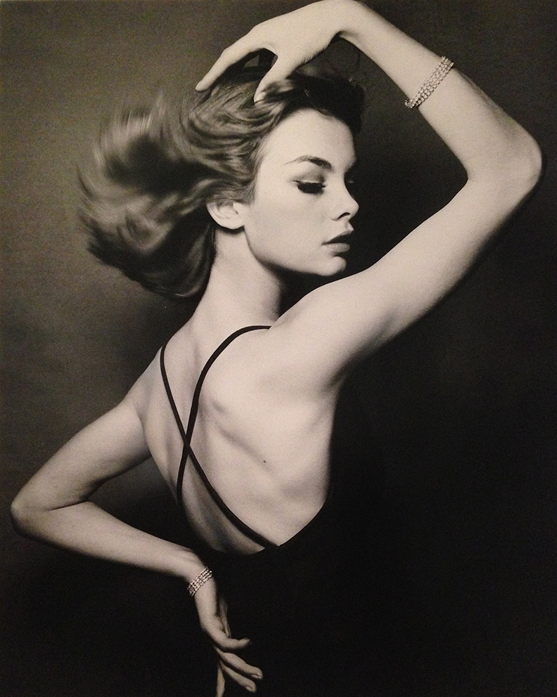
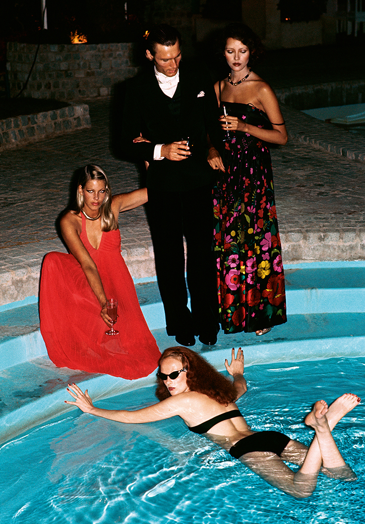
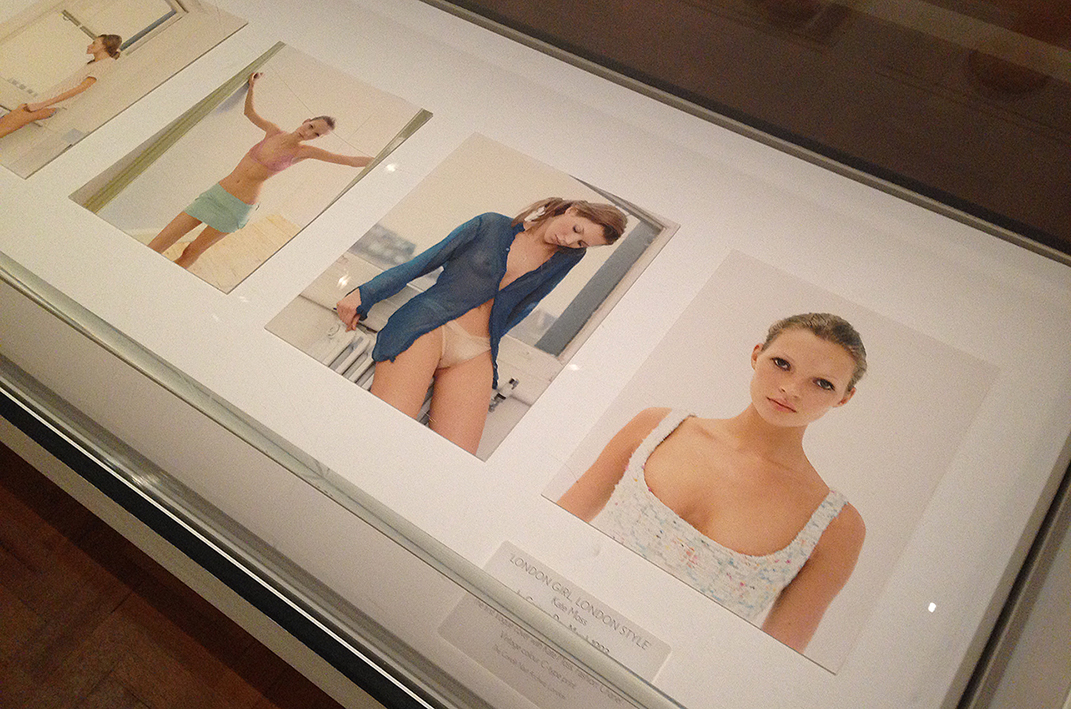 In 1916, in the middle of the First World War, the proprietor of Vogue, Condé Nast, green lighted a British edition as the transatlantic shipments of American Vogue became impossible. Each room of the Vogue 100 exhibition presents a decade of photographs that featured in the magazine. The Swinging 1960s are represented by models of that era including Twiggy and a beautiful image of Jean Shrimpton by David Bailey. Provocative, bold images by Helmut Newton and Guy Bordin from the grim 1970s, and the entire set of prints of the infamous underwear shoot of Kate Moss by Corinne Day from the ‘grunge’ trend in the 1990s.
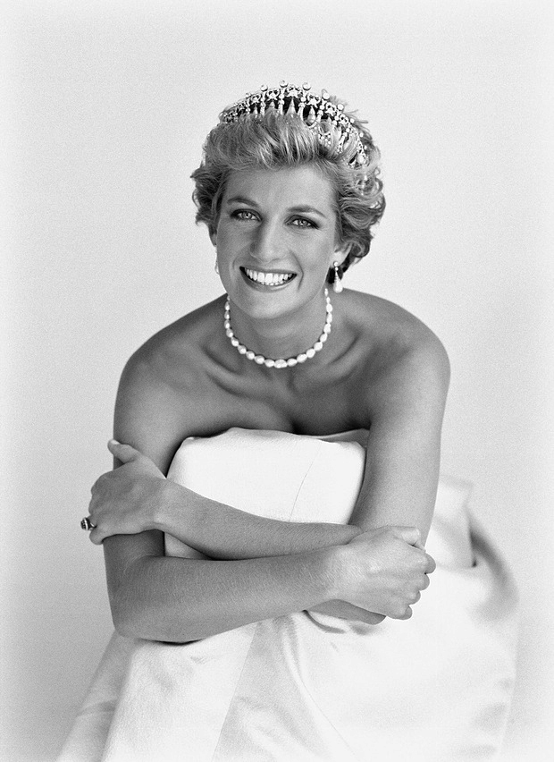 The show also features an impressive selection of iconic pictures such as Charlie Chaplin by Edward Steichen, Margaret Thatcher by David Bailey and Diana, Princess of Wales by Mario Testino as Vogue always had access to the leading figures in the arts, politics and royalty.
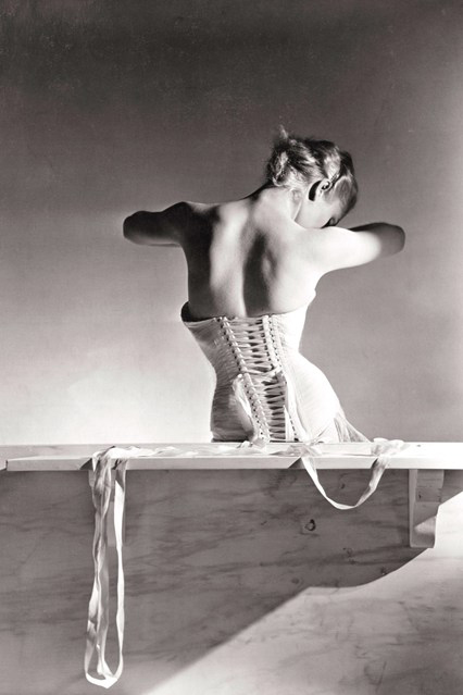 Also, on display a selection of highly sought after vintage bromide prints such as ‘Detolle Corset for Mainbocher’ (1939) by Horst and ‘Modern Mariners Put Out to the Sea’ (1930) by George Hoyningen-Huene. When you look at these 1930s images you won’t disregard them as fashion images. They have become as supremely collectible as ‘Ingres’s Violin’ by Man Ray or ‘Sunday on the Banks of the River Seine’ by Henri Cartier-Bresson.
200% spoke with Robin Muir what defines a Vogue photograph; the key figures in shaping the visual language of the magazine, and the lengths to which photographers go to create the perfect picture.
 200%: This exhibition is a selection of 100 years of British Vogue’s iconic fashion, beauty and portrait photography. How would you define the style of photography of the magazine?
Robin Muir: In a funny sort of way I hope there is no such thing as a typical Vogue photograph. When you think of the names that have made up the magazine over the years, from Cecil Beaton to Irving Penn, to Mario Testino, they are all illustrious and very distinct photographers. I think what unifies them together is this relentless pursuit of perfection. Nobody wants to do a bad photograph for Vogue.
The lengths to which photographers will go to make the perfect picture is extraordinary. I think of the wonderful picture of Lily Donaldson by Nick Knight. It took him two years to make that print the way he wanted. [The image was based on John Galliano’s Spring 2003 Ready-to-Wear where he bestrew paint over the models]. The post-production is phenomenal and the print is absolutely flawless. No expenses were spared for that picture.
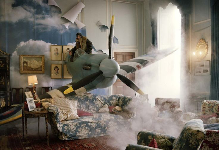 Or, when you look at Tim Walker’s pictures. The lengths he will go to make the perfect picture, the amount of sheer artistry that goes into one set-up is extraordinary. I don’t think that the word budget exists in his vocabulary. It is this absolutely relentless pursuit of perfection. The great thing about Tim is that he will only work with film, not digital, and he will not digitally manipulate his photographs in the slightest. Everything you see in a Tim Walker photograph actually happened. It is in front of his lens. That spitfire coming out of the wall how easy would it be for him to superimpose it, but he didn’t. Once you know that, the photographs have a real sort of honesty and integrity – that is quite something.
 Vogue is the showcase – this is where your reputation is made. And let’s face it, Vogue may not pay photographers a huge amount of money but the photographers know that Vogue is this window to the world. They will get the wonderful advertising commissions because of the production values put in by Vogue. It’s a great transaction.
The editorial staff of Vogue, has an instinctive understanding to asses: this is, and this is not a Vogue photograph. I know that British Vogue does not willingly kill photographs. Nobody can do that now. You have to make sure that the photographers you commission are going to deliver the photographs that you want. When I first started in magazines in the 1980s you could do a shoot and if you didn’t like the final result you kill it. There was money to do more, you discarded the picture. It doesn’t work like that anymore. We’re in difficult times. Nobody can pretend that print journalism is not slightly under pressure.
 200%: You created a wonderful room displaying 100 Vogue magazines, one for each year each, in vitrines where people can see how the photographs were published in context of the magazine. Was there a specific idea behind this?
RM: I wanted to show how much art direction and graphic design has contributed to the success of Vogue. Every month they would redraw the Vogue logo on the cover of the magazine, for instance, in stars or made out of rope. The part that the art-directors have had in the magazine is incalculable. They are the real stars of it. It’s not all about taking a great picture. It has to look right in context and I think the art directors are the unsung heroes. Harper’s Bazaar had Alexey Brodovitch and Vogue had Alexander Liberman.
200%: One person who should be mentioned as well to be very influential in shaping Vogue’s visual language is Diana Vreeland, editor of American Vogue in the 1960s.
RM: Well, in the context of British Vogue, not necessarily, as she probably had nothing to do with the British edition, but as a fashion historical figure she is extraordinary. I would have love Diana Vreeland to be editor of British Vogue. Vreeland appeared on the scene at Vogue at exactly the right time. When the age of jet-travel had just started she could send Henry Clarke out to India or South America to take photographs. In those days magazines were hugely successful. They money was there to act out your greatest fashion fantasy and create larger than life images.
Vogue is really about fantasies and taking you away from your daily cares. British Vogue was a born in 1916 at the height of the First World War. It struck me when you look at the very first few issues of Vogue it’s like the war doesn’t exist. The Vogue editors reasoned, who wants to read about the war all the time when you’re living through it. You want to read about something else. So Vogue is very much about fantasy and escapism.
Interview written and conducted by Thierry Somers
Limelight Nights by Helmut Newton, 1973, copyright The Condé Nast Publications Ltd
Vogue 100: A Century Of Style is on until 22 May 2016 at the National Portrait Gallery in London.